
By default, web pages can be zoomed on mobile devices. With the typical two-finger gesture, the web page can be enlarged or reduced in size. If you don’t want this, you can prevent it.
The key is a Meta-Tag. The attribute “viewport” can be used to preset and prevent the zoom:
<meta name="viewport" content="width=device-width, initial-scale=1.0, maximum-scale=1.0, user-scalable=no" />
The code loads the page with 100% zoom, the maximum zoom level is also 1.0 so 100%. In addition, “user-scalable=no” prevents the user from zooming in.

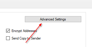
In DA-FormMaker we can insert the meta tag under “Advanced Settings” (tab Settings):
Now insert the line into the head area:

If there is already a “viewport” inside, you overwrite it. Afterwards the form only has to be exported again.
Zoom is no longer possible. If the browser supports it. The procedure only works if the browser does the same. Iphone users can always zoom in new IOS versions:
To improve accessibility on websites in Safari, users can now pinch-to-zoom even when a website sets user-scalable=no in the viewport.
Safari ignores the setting and still allows zooming.
If you embed the form as an iframe, the tag or setting must be added to the main page. In such cases the design should of course be responsive and optimally displayed with the fixed display.

